Part 3, exercise 3.1: Monotype portraits with paint – 20 preparatory ink studies and a few test prints

22 August 2017. Since I have never used monotype before except once for a very quick sketch, I knew that it would be essential to invest some time in preparing mind and workplace.

First of all I had some pieces of glass with smooth edges cut in sizes A5, A4 and – ambitious – A3 as well as some 40 x 50 cm mirror glass as our only mirror suitable for painting is build into our bathroom wall.
Next I had a good look at several online videos explaining monotype techniques and came away with some invaluable additional hints for working with acrylic paint instead of oils. They were:

  • cover the glass in gloss medium before starting to paint, this aids the lifting of the paper
  • try and use thin layers of paint
  • moisten the printing paper before use, wait for a few seconds before using it (have several ready in a plastic bag)
  • use roller to exert uniform pressure

A video introducing the use of four colours on acetate sheets (Blick Art Materials, 2009) was something I want to keep at the back of my mind, just in case the printing works well enough to allow me to experiment with something a little more complex.

25 August 2017. Found work by Kentridge again and discovered just now that in the 1970s he made a set of up to 30 monoprints called the “Pit” series (Kentridge, 1979).

28 August 2017. Yesterday I prepared my sketchbook for this part of the course (Fig. 1-5), then started the painting, reluctantly, because I am not keen on observing myself in mirrors and am generally less interested in my own face than the rest of the world.

The prescribed research as set out on p. 66 of the study guide did not focus on artists making monotypes, but rather on painting styles suitable for quick monoprints and the examination of tonal values.

1_Sketchbook_intro_research_1_28082017
Figure 1. Sketchbook – introductory research: Annie Kevans and Alli Sharma
2_Sketchbook_intro_research_2_28082017
Figure 2. Sketchbook – introductory research: Kim Baker, Geraldine Swayne and Eleanor Moreton plus own technique from POP (top right)
3_Sketchbook_intro_research_3_28082017
Figure 3. Sketchbook – introductory research: Edgar Degas
4_Sketchbook_intro_research_4_28082017
Figure 4. Sketchbook – introductory research, top: Paul Wright, unknown artists and Clara Lieu, bottom: techniques mind map

I decided to select those styles, which held the greatest promise for my own attempts and made a small mind map plan to structure my 20 sketches (Fig. 4, bottom). 5 each of my ink sketches would be devoted to testing the styles of Annie Kevans (dilute, fine brush), Paul Wright (dilute, coarse brush), Edgar Degas (wiping off dark background) and Clara Lieu (grey background, painting into and wiping off that background).

Sitting at my drawing table, writing into my sketchbook with my mirror in position on a table easel, I noticed that this view could be interesting for my quick sketches. I intended to place the self-portrait in the lower righthand corner and create an impression of someone sitting opposite absorbed in communication. I made a rough pencil sketch of the situation (Fig.5).

5_Sketchbook_intro_research_5_28082017
Figure 5. Sketchbook – top: testing arrangement for ink sketches, bottom: recording exeriences with first set of 5 sketches (Kenvans style)

I soon found out that I would not be able to do my idea justice with my 1 minute sketches. 60 seconds are an awfully short time to create a meaningful portrait. My paintbrush, a very nice watercolour brush combining a large size body with an additional central pointed tip, helped me in switching from fine to wide brushstrokes without having to reload more than a few times, but these movements alone used up over half the painting time. I noticed that I would have to make the sketches larger than intended, so in the end I just settled for letting things develop (Fig. 6-8). The first two sketches were awkward, no. 1 suffered from temporary rustiness of the artist’s hand and from forgetting that we only had one minute to complete the sketch. The second was somewhat better, but I was far too slow to be able to consider the tonal values across the whole face (Fig. 6).

Figure 6. Annie Kevans style sketches no. 1 and 2

Next I had a good look at the tonal values before starting to paint but still ran out of time. The fourth attempt was then made without my glasses on so as to force myself to reduce attention to detail. I decided to do the painting including the squint (Fig. 7).


Figure 7. Annie Kevans style sketches no. 3 and 4

The last, and in my opinion best so far, sketch I produced after reducing the light level in my workshop by pulling the blinds down (Fig. 8).

10_ink_sketch_AKevansstyle_5_28082017
Figure 8. Annie Kevans style sketch no. 5

Overall I noticed that with every sketch my confidence increased in what I did. There is absolutely no likeness in any of the above (at least I hope so ;o)), but I can recognize the immense value of working quickly. The paintings are relatively lively, especially the last one. Also, I can see that I managed to transport the facial expression correctly, i.e. the intensity in straining to observe.

Thoughts and adaptations for the next round testing a Paul Wright style:

  • have the blinds down from the start
  • change from straight-on view to slightly from one side, if possible (second mirror??)
  • try and look less stern
  • prepare all the sheets of paper before starting to paint and use them all in one go without a break
  • make a preliminary pencil sketch to get acquainted with the idea of where to place light and dark areas
  • sit still for a short while to allow the information to sink in
  • use a wide, coarse paintbrush with less dilute ink

The above I tried today and got results not really worth mentioning. Despite having prepared by carefully studying tonal contrasts I was unable to achieve anything in 1 minute, the time was simply too short for my kind of experience. Using the coarse brush would be extremely interesting once I have acquired more experience in distributing a paint load from the initial dark and liquid to the final light and dry brushmarks. As things are there is simply not enough time to think at all. So, here are the results, first my sketchbook pencil sketch (Fig. 9), which I was happier with than my first one, it is less strained, then the awful series of rough ink sketches (Fig. 10). In contrast to my first series here the more I tried the worse they got …

11_sketchbook_pencil_sketch_tonal_28082017
Figure 9. Sketchbook – examinig tonal values adead of starting the second ink sketch series


Figure 10. Paul Wright style ink sketches

When doing the scans for this blog I noticed that the scans revealed some quality areas, however small,  in some of the sketches, which I would have missed by looking at the originals only, for whatever reason. The same effect I had seen when scanning and printing the fields in my Assignment 2 umbrella project, where the prints allowed me to identify patterns where I saw something different and less interesting or nothing at all in the originals. Strange, but definitely worth remembering.

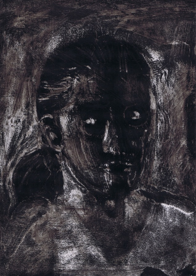
So, again there is no likeness, but as in the first series I noticed that I did succeed in transporting the overall facial expression and mood, more relaxed this time, but still serious-looking. If I had to make a choice, I would discard no. 1 and 5 immediately. The remaining three share a common “hurting” look. At first I wanted to throw away no. 3 (top right), but seeing it in conection with the rest, I believe that it may be the strongest of them. The person appears both mentally and physically hurt.
Regarding technique: It was next to impossible to imitate Paul Wright’s style with the available materials, tools and time. Despite not being able to reproduce them correctly with my coarse paintbrush, I became increasingly familiar with the distribution of tonal values.

29 August 2017. We have been growing alum crystals with out little son over the summer holidays. So I thought that I might start my alchemy lab again and use some of the leftovers for painting. I found out that alum is commonly used as a mordant (fixing agent) in marbling. What else can be done with it I tried find out for myself in the course of the next series of experiments with ink. The first set (Fig. 11-13) was done on gloss medium vs. alum as backgrounds, and water-soluble vs. waterproof black ink, using a coarse flat paintbrush to achieve a mark-making resembling Paul Wright’s style.

18_sketchbook_Degas_ink_wipe_01092017
Figure 11. Sketchbook – top: gloss medium background, bottom: alum background; left side: water-soluble ink, right side: waterproof ink

The largest differences here were the slight browning effect of both types of ink on the gloss medium, which did not occur at all on alum, and, oddly, the greater ease of wiping off the waterproof ink on both backgrounds. I suspect that the properties of the water-soluble ink allows the liquid and pigment to soak through the transparent coat into the paper, were it is then out of reach. Half-dry waterproof ink, when wiped off with care, will leave interesting ragged darker edges (Fig. 11, top right).
Next I tested both types of background again, but this time using black linoprint colour and a paper kitchen towel with (ample) spirit to spread and wipe off the paint (Fig. 12).

19_sketchbook_Degas_ink_wipe_2_01092017
Figure 12. Sketchbook – top: gloss medium background, bottom: alum background; all test fields: linoprint paint spread with kitchen towel and spirit to help wiping off the paint

As the above looked a lot more promising regarding a possible wiping off of paint within the given time-frame of 1 minute, I produced an imaginary portrait on gloss medium background covered in a more or less uniform layer of linoprint paint. On the first day I managed something looking static and sombre with a kitchen towel, cotton buds, spirit and a lot more time than one minute (Fig. 13), the day after I tried to continue experimenting, but found that the paint was much harder to remove, so achieved only slight changes before I had to give up (Fig. 14).

17_sketch_dark_background_printing_ink_stage1_01092017
Figure 13. Imaginary self-portrait using linoprint paint on gloss medium background, wiping with spirit, stage 1
22_sketchbook_dark_backround_printing_ink_stage2_07092017
Figure 14. Sketchbook – imaginary self-portrait using linoprint paint on gloss medium background, wiping with spirit, stage 2

What I had not anticipated was the interaction between linoprint paint and spirit. When applied with a cotton bud, the spirit would travel some distance to cover a larger area than intended. If left for a while, the paint in the wider area would come off, too, and also this area would be bounded by a brilliantly white edge, presumably because the action of the spirit at the edge would affect a smaller surface area. This surprising effect can add a new quality to a painting, if in the right place. Since I do not expect the same effect to work when applying linoprint paint to a glass plate, I ignored it and proceeded to repeat the experiment, this time with gloss medium and black gouache (a background I had already tested in Assignment 1 (Lacher-Bryk, 2017a) (Fig. 15).

20_sketchbook_Degas_gloss_linoprint_spirit_07092017
Figure 15. Sketchbook – testing the wiping with spirit on a background of gloss medium and black gouache

The combination of gloss medium, gouache and spirit allowed the greatest flexibility so far.

Next I proceeded to make a few very quick test prints with my A5 glass plate on good quality A4 sketch paper, first using antique inks (Fig. 16), then my planned paint, acrylic diluted with gloss medium (Fig.17-18).

21_sketchbook_monoprint_test_antique_inks_07092017
Figure 16. Sketchbook – testing monotype with two layers of splodges of antique ink
23_sketchbook_monoprint_test_acrylic_glossmedium_07092017
Figure 17. Sketchbook – testing monotype with Paynes grey acrylic diluted with gloss medium
24_sketchbook_monoprint_test_acrylic_glossmedium_inverted_07092017
Figure 18. Sketchbook – testing monotype with Paynes grey acrylic diluted with gloss medium, inverting Fig. 17 by painting in the spaces not covered by the painting in Fig. 17

I noticed very quickly that I would need a lot more practice with both the above media. The inks, if used thinly, will dry so quickly that printing is hardly possible, and if in larger quantities, they will spread on the glass with enormous ease, so that the outcome of a painting would be pure coincidence. With gloss medium-diluted acrylic paint spreading was no problem, but no matter how great the care taken to lift the paper, there would remain ungainly ridges (easy to see in Fig. 17), the more so the greater the quantity of gloss medium. I decided to stop using gloss medium for this purpose.

2 September 2017. As the results of my first attempts at trying out monotype were a bit pathetic, I felt it necessary to do more research on the available techniques and their prerequisites, before preparing my third and fourth sets of ink sketches. I sat down to plan Part 3 with another mind map (Fig. 19).

25_sketchbook_mind_map_part3_07092017
Figure 19. Sketchbook – mind map planning Part 3 of the course, first version

I also did some lengthy research on the do’s and dont’s of monotype and found that I should use thinner paper to print, on which I can paint, carefully, while it is still on the glass plate:

Or how to use soot mixed with linseed oil to make “paint”:

Or else to use linen rags or other kinds of cloth as printing surfaces. It would also be interesting to make my own gelatine printing plate, but it can only be used for a short while before it dries out:

Another link introduced the use of stencils, nets, ripped strips of paper, cut paper etc.:

7 September 2017. Assignment 2 results and feedback reflection (Lacher-Bryk, 2017b) overtook last week’s rough ideas, so that today I find myself with a detailed plan for Part 3 (Lacher-Bryk, 2017c). Also, since I sorted through my painting materials today to make room for the monotype exercises I stumbled over the oil paint I had left on the table to make myself use it again after 15 years. Spontaneously I decided to try making a few rough monoprints on normal A4 copy paper, using just one colour (Fig. 20-23). I was very happy to see that the paint is still OK and the printing was much easier than with all the paint I had tried out before. It was easy to push the paint around on the glass and create accumulations, but I will need to find a set of paintbrushes or other tools allowing me to manipulate the paint with greater detail. I also must not let too much paint accumulate in one place, because it will produce an ugly, oily splodge. The brushstrokes left by my coarse paintbrush produced lively patterns, which might be used as part of the painting, but will need practice to work well.

31_oil_monoprint_test_1_08092017
Figure 20. Test print – oil on photocopy paper, coarse brush, no dilution
32_oil_monoprint_test_2_08092017
Figure 21. Test print – oil on photocopy paper, soft brush, diluted
33_oil_monoprint_test_3_08092017
Figure 22. Test print – oil on photocopy paper, soft brush, diluted, inverting Fig. 21

Figure 23. Test prints – left: oil on photocopy paper, using leftover oil paint to produce an imaginary 1 minute sketch with coarse brush, using roller to make the print, right: ghost print, applying pressure by hand

8 September 2017. After some time finding excuses I went back to produce the last two of my series of 1 minute ink self-portrait sketches. This time I decided to see whether I could find my own style, in the first set I using ink with little water added and a thin brush (Fig. 24), in the second a large soft brush and highly diluted ink (Fig. 25). With all of them I tried emphasizing the tonal emphasis by adding darker ink. I noticed that I became increasingly familiar with my face, so that I was able to add somewhat more detail. I also tried to look less strained. In the first set I can now see parts of myself in parts of the paintings (except in no. 3 and 5). The painting with the large brush in the second set was too difficult for my present skills, so hardly and likeness there.

Figure 24. Ink sketches, own style, little water added to ink, thin round paintbrush

Figure 25. Ink sketches, own style, high degree of dilution, large round paintbrush

Overall, looking back at this exercise, I could probably go on and on with my 1 minute sketches, without any of them looking like me :o). Every time I start again I see new aspects to pay attention to, which precludes paying attention to the other parts of the composition. For example, over the time it took me to complete the final set the sun started going down and I noticed a deepening of the shadows. Unfortunately I was not able to reproduce this effect, but I was happy to notice the slight differences in tonal values. In one or two of the sketches I was interrupted by phone calls. While speaking on the phone I continued with my sketches, which turned out looser than the rest.
I cannot say whether I will be able to use any of my sketches as templates for the following exercises, but I very much enjoyed using them for my test prints. Also I am glad to have finally brought myself to open my oil paints again and I will be using them for monoprinting in this part of the course. The print quality is so much better than anything I tried to do with acrylics, linoprint colour and gloss medium and the paint was a lot of fun to use. So oil it is going to be!

References

Blick Art Materials (2009) An Intro to Akua Kolor and Monotype Printing [online]. Blick Art Materials, Galesburg. Available from: https://www.youtube.com/watch?v=oIYny3uwXxM [Accessed 22 August 2017]

Kentridge, W. (1979) Pit [monoprint series] [online]. [n.k.], [n.k.]. Available from: http://doublevision-berlin.de/werke/william-kentridge-pit-1979/ [Accessed 25 August 2017]

Lacher-Bryk, A. (2017a) Assignment 1: Twenty 15×15 cm Shadows [blog] [online]. Andrea’s OCA blog: Understanding Painting Media, 9 May. Available from: https://andreabrykocapainting1upm.wordpress.com/2017/05/09/assignment-1-twenty-15×15-cm-shadows/ [Accessed 7 September 2017]

Lacher-Bryk, A. (2017b) Assignment 2: Tutor Feedback Reflection [blog] [online]. Andrea’s OCA blog: Understanding Painting Media, 5 September. Available from: https://andreabrykocapainting1upm.wordpress.com/2017/09/05/assignment-2-tutor-feedback-reflection/ [Accessed 7 September 2017]

Lacher-Bryk, A. (2017c) Part 3: Preliminary planning of the practical work [blog] [online]. Andrea’s OCA blog: Understanding Painting Media, 7 September. Available from: https://andreabrykocapainting1upm.wordpress.com/2017/09/07/part-3-preliminary-planning-of-the-practical-work/%5BAccessed 7 September 2017]

Part 3 introductory research point: Monotype and loose paint in creating portraits

20/21/22 August 2017. In order to gain the most from my research, I decided to get a quick overview over the artists listed in the research point on p. 66 of the course guide (Open College of the Arts, 2015), then select those with the best connection to my own work and look at these in depth.

Annie Kevans (*1972, France/UK)

My impression is that Annie Kevans’ technique of portraiture with thinned oil paint (Kevans, n.d.) on canvas always follows the same principle. Human perception is selective and Kevans appears to highlight those parts of a face, which our perception is most attracted to and can gain the most immediate appreciation of gender and mood, that is eyes and mouth. Also, the portrayed persons mostly look directly into the eye of the viewer, which is fascinating in its own right, because it is possible to stare back without breaching a social convention. Apart from the more detailed parts of a face Kevans leaves the head as a loose and rough, though highly sensitive, sketch. The paint is used in various degrees of dilution and the light brown mix used to paint the initial sketch combines the colours used in the highlights. Both result in harmony and allows the viewer to focus on the message the faces send. It should be possible to draw on her technique in my first attempts at creating a monotype self-portrait.

Note:
Here the technique of creating a monotype portrait as described in the course guide (Open College of the Arts, 2015, pp. 67-74) comes to mind. When I place a photo under my glass plate, paint that photo and make a monotype print, the result will be a mirror image of the original. This means that the likeness of the printed portrait may suffer. In case I want to use a photo I should take care to print the photo as a mirror image first, then use that as basis.

Alli Sharma (*1967, UK)

When I first saw the work by Alli Sharma at the start of this course, I did not feel too much connection except for some of her black and white oil portraits (Sharma, n.d.). Their style is quite different from that of Annie Kevans. The persons invariably look away from the artist, an approach that has been, in my opinion, used excessively by too many artists in recent years. What makes them interesting are not so much the facial features but the distribution of light and dark and the coarse brushstrokes using dilute oil paint. With some experience the latter are probably a good basis for a beginner’s series of monotype experiments.

Note:
As we are required to produce a series of self-portraits using ink, I will have a variety of brush sizes ready, including a wide flat one.

Eleanor Moreton (*1956, UK)

Again I could not find monotype work, but only the skillful application of dilute paint, which can again be used as a basis for planning my own painting work in preparation for printing. Her work reminds me of Annie Kevans. This is especially evident in her “Absent Friends” series (Moreton, 2013-14). One particularly haunting painting is “Bet/h I, 3”, an oil on canvas portrait from 2008. The portrayed person comes in the colours of a clown, but since it is so blurred I am left with an assumption. I have never been able to enjoy what clowns are and do. Their bizarre behaviour and painted grin belying the true mood of the person in the clown’s costume are enough to leave an uneasy feeling. Apart from that the technique of applying paint here may be well worth trying in monoprints.

Note:
I might try and develop my own idea of using coloured shadows in my self-portraits in that direction.

Geraldine Swayne (*1965, UK)

As with all artists I researched so far in the list I could not find any work declared monotype. Swayne specializes in miniature paintings on enamel or metal surfaces, although on Saatchi online (n.d.) some of these paintings are listed in the printmaking category (although not monotype). Superficially her portraits may look somewhat traditional, but on second glance they leave an unsettling afterglow. Swayne’s use of paint is far more prolific than in all of the above artists and the intiguing effects created with enamel paint on metal are something to remember.

Note:
Although we are advised to use oil paints for making our monotypes, I need and want to stay with my acrylics and water as well as gloss medium to dilute. For Practice of Painting I made a still life (Lacher-Bryk, 2016), where a certain degree of dilution and application to a dry layer of acrylic paint caused the paint to behave in a way similar to that of the enamels used by Swayne.

David Bomberg (1890-1957, UK)

I found some fascinating, coarsely painted portraits and self-portraits, whose weird combination of colours to depict light and shade I want to remember. My favourite among the portraits I saw was “Talmudist” (Blomberg, 1954) (Fig. 1 below).

Bomberg, David, 1890-1957; Talmudist
David Bomberg (1953) “Talmudist”. Source: David Bomberg (1890-1957), photo: Pallant House Gallery, Chichester. Available under a CC BY-NC-ND licence.

Tracey Emin (*1963, UK)

As suggested on p. 66 of the study guide I had a look at the drawings available online from Emin’s monotype collection “One Thousand Drawings” (random images coming up in browser). To be honest, I am not too happy with what I see. The drawings look like careless scribbled notes capturing thoughts passing through the mind. It is very obvious that Emin would be far better at drawing than that, and she is not doing justice to herself here in that respect. Of course I am aware that many contemporary artists use deliberate neglect to raise attention, but I am not advanced enough at developing a reliable critical view to be able to see a further purpose behind her particular style.

Note:

This is not what I would want to test in my own monoprint series, but I may want to think about including text.

Michael Craig Martin

The most important message to take from Martin’s 1995 essay “Drawing the Line: Reappraising Drawing Past and Present” is probably the one found in an extract shown by Occasional Press on their homepage as part of advertising the book “Drawing Texts”: Martin emphasizes the observation, which is not at all surprising, that drawing as a distinct art form can only be appreciated as such in our time, when finished artworks are supposed to exhibit all that drawings have always contained, i.e. “These characteristics include spontaneity, creative speculation, experimentation, directness, simplicity, abbreviation, expressiveness, immediacy, personal vision, technical diversity, modesty of means, rawness, fragmentation, discontinuity, unfinishedness, and open endedness” (Occasional Press, n.d.).

Note:

I will try and get hold of the whole article. It will probably contain an explanation for the praise Tracey Emin receives for her drawings.

Albrecht Rissler (*1944, Germany)

He was a lecturer in one of the courses I attended at the Bad Reichenhall art academy some years ago. Rissler is a fantastic draughtsman (Rissler, n.d.) and introduced our group to a very simple monotype technique. Although it was based on drawing I still remember the great effect of having a more or less uniform dark grey background (printing ink as far as I can remember) into which Rissler drew with some added pressure on the back of the paper, while it was still on the glass plate, a little valley reminding of an ancient hollow-way.

Note:

Although I am aware that we are expected to use monotype in a much more painterly way, I might try and include drawn marks into the prints once I have acquired a certain minimum knowledge in preparing a suitable bakground.

Kim Baker (?)

I am not sure whether I found the correct Kim Baker, since there are several of them. The only one I think comes anywhere near the subject of Part 3 creates series of colourful flower “portraits” with bold brushstrokes, owls and other birds (Baker, n.d.). A few other Kim Bakers are painters in the USA, but none of them makes portraits or monotypes either. Will leave her for the moment.

Overall this research helped me to define a first idea of how to approach my monotype experiments. Again I will remain with my reduced colour palette and carry over my subject of shadows. In this respect the approach by Alli Sharma would be quite suitable for me, but I would probably try and carefully include colour in places in a way similar to Annie Kevans, but at the same time testing the unnatural, e.g. coloured shadows, and their effect on the character of the portrait (thinking of the Marilyn Monroe print series by Andy Warhol, but less gaudy and with a psychological message to the colours, if possible). I think that this way a strange series of self-portraits might emerge. On Pinterest I found a number of wonderful monotype portraits and techniques, including some brilliant ones by Edgar Degas. These I will not discuss here, because they will appear as printouts in my sketchbook and I will have a closer look at them while I work on my monotype series. Some of the above connect in a way to my Assignment 2 umbrella project (Lacher-Bryk, 2017) and might help me in planning my approach.


General references

Lacher-Bryk, A. (2016) Part 4, project 5, exercise 1: Working from drawings and photographs – painting from a working drawing [blog] [online]. Andrea’s OCA Painting 1 blog, 24 November. Available from: https://andreabrykocapainting1.wordpress.com/2016/11/24/part-4-project-5-exercise-1-working-from-drawings-and-photographs-painting-from-a-working-drawing/ [Accessed 20 August 2017]

Lacher-Bryk, A. (2017) Assignment 2: “An Umbrella Project” [blog] [online]. Andrea’s OCA blog: Understanding Painting Media, 17 August. Available from: https://andreabrykocapainting1upm.wordpress.com/2017/08/17/assignment-2-an-umbrella-project/ [Accessed 20 August 2017]

Open College of the Arts (2015) Painting 1: Understanding Painting Media. Open College of the Arts, Barnsley.

Annie Kevans

Kevans, A. (n.d.) Art

This slideshow requires JavaScript.

[online]. Annie Kevans, [n.k.] Available from: http://www.anniekevans.com/art [Accessed 21 August 2017]

Alli Sharma

Sharma, A. (n.d.) Paintings [online]. Alli Sharma, [n.d.]. Available from: http://www.allisharma.com/allisharma/Paintings.html [Accessed 21 August 2017]

Eleanor Moreton

Moreton, E. (2008) Bet/h I, 3 [oil on canvas] [online]. [n.k], [n.k.]. Available from: http://www.eleanormoreton.co.uk/beth-i-3 [Accessed 21 August 2017]

Moreton, E. (2013-2014) Absent Friends [online]. Moreton, [n.k.]. Available from: http://www.eleanormoreton.co.uk/absent-friends-1/ [Accessed 21 August 2017]

Geraldine Swayne

Saatchi Art (n.d.) Geraldine Swayne [online]. [n.k.], [n.k.]. Available from: https://www.saatchiart.com/geraldineswayne [Accessed 21 August 2017]

David Bomberg

David Bomberg (1953) “Talmudist”. Source: David Bomberg (1890-1957),Available from: https://artuk.org/discover/artworks/talmudist-70525/search/actor:bomberg-david-18901957/page/2 [Accessed 21 August 2017]

Michael Craig Martin

Occasional Press (n.d.) Drawing Texts Extracts: from Drawing The Line by Michael Craig-Martin. Occasional Press, [n.k.]. Available from: http://www.occasionalpress.net/drawingtext/dtextract3.htm [Accessed 22 August 2017]

Albrecht Rissler

Rissler, A. (n.d.) Albrecht Rissler [online]. Albrecht Rissler, [n.k.]. Available from: http://www.risslerart.de/ [Accessed 22 August 2017]

Kim Baker

Baker, K. (n.d.) Paintings [online]. Kim Baker, [n.d.]. Available from: http://www.kimbaker.co.uk/portfolio.php [Accessed 21 August 2017]

Research Point: Painting Style – historical and contemporary painting

20 March 2017. It took me a while to grasp the concept underlying the very first parts of my new course, since the research points here are much more directly connected to the actual work required in the exercises to follow than in the previous courses. In order to achieve a maximum gain from my research activity I will try and follow consistently the points listed on pp. 31-32 in the study guide (Open College of the Arts, 2015), when combining theoretical and practical research:

  • How does it make you feel?
  • Do you like the work?
  • What does it remind you of?
  • What about the composition?
  • What style is the work in?
  • What colour palette has the artist used?
  • What is the subject?
  • What’s the significance of the title?
  • What’s the date?
  • What medium has the artist used?
  • What about the support?
  • Where is the work exhibited?

While most of the information (the last 8 points) will, most of the time, come with the painting anyway in print or online, composition and style may require some additional research and the first three points are highly personal. It is interesting that the OCA put the questions in this order. I will try and follow just this: let the work of art do its magic, then deal with the statistics, and not vice versa.

We are advised to research in detail at least one artist listed in one of six style categories on p. 36 of the study guide (Open College of the Arts, 2015). After having had a quick look at all of the artists I chose my subjects on impulse (and not just by liking!). Here is the result of my research. I am not quite sure if and how all of these relate to the tasks set for exercises 1.1 – 1.4 in Part 1 (“Using Found Images”) of the course, but the connection may evolve while experimenting. The works chosen I will print out and put in my new research sketchbook, which I started alongside the exercise sketchbook, where I hope the influence of the artist to become part of my own work:

Slick, flat paint

  • Gary Hume: bold, simple, colourful, flat, reduced palette (reminds me of Alex Katz)
  • Sarah Morris: geometrical, large size, sober (reminds me of Joseph Albers)
  • Ian Davenport: seen him before (Practice of painting, lines (reminds me of ….. woman painter line castle, think)
  • Inka Essenhigh: like Arik Brauer, mystic, elaborate, luminous (like the subject)
  • Jane Callister: abstract, colourful, landscapes, looks like poured paint (like the technique)
  • Brian Alfred: townscapes, geometrical, sober, political, looks like photos painted over

For me the cool, geometrical and sober approach is not what I am after, because it is not what I would naturally do, but maybe this is exactly what I will need to contemplate, so here come, as a contrast, Inka Essenhigh and Brian Alfred.

23 March 2017. On the Victoria Miro Gallery’s website (Victoria Miro Gallery, n.d.(a)) Inka Essenhigh‘s (*1969, USA) approach is described as follows: “With its pristine, high-gloss surfaces and accentuated colours Essenhigh’s work moves towards an almost sculptural three-dimensionality in its delineation of forms.” While I am not so much drawn to her earlier cartoonlike style, many of her more recent paintings radiate enormous energy and it was difficult to choose two favourite pieces.
In the end I went for “Snow” (2007) (Victoria Miro Gallery, n.d.(b)) and “Stubborn Tree Spirit” (2012) (Victoria Miro Gallery, n.d.(c)), both large size oil paintings on canvas. Their immediate appeal comes from the connection I feel between Essenhigh and Arik Brauer, as mentioned above. I love how in her hand seemingly mundane subjects show the eerie side of their existence, as if parallel worlds existed in one space. This allows the natural world to be not just populated by, but merged with, an all-encompassing spirit. Her attention to detail, meticulous composition (appearing to be derived from a diverse array of styles from the renaissance via Japanese woodblock printing to contemporary cartoons) and execution and use of high-gloss finishes all help to enhance the effect. Essenhigh’s style has been described as “pop surrealist” or “lowbrow”, which comes along with a humorous view on the chosen subjects (Schultz, 2014). This is maybe also why I feel an affinity, since my own approach is similar.

Brian Alfred (*1973, USA) appears to me to have a very technically minded approach to choosing his subjects, thus his combination of traditional and new media appears to reflect that well. On Sedition (n.d.) he is described to create “flattened and usually depopulated worlds of color reproduced in two dimensional bold patterns, often derived from found images.” When browsing his work on the Internet (see e.g. Artsy, n.d.,) this is exactly how his world feels. At the risk of sounding unfair and preoccupied, I have to admit that to me it appears as if Inka Essenhigh had drawn all the spirit from his world to use in her own. I feel a tremendous energy imbalance between the two here, but have not yet been able to pinpoint the source. There is one image I quite like, however, titled “Animation and DAF and MARFA/May 5 2015” (Alfred, n.d.). It appears that it is a screenshot taken from an animation created by Alfred, but I was unable to find that. To me this image is attractive for its wonderful composition, consisting from a low angle shot of an urban high-rise bridge with a full moon rising at eye level. I love the choice of colour and, as it is near dusk, the flattened appearance of the view is completely believable. As a contrast I chose a second work, which I thoroughly dislike, in order to make this the basis of a compare and contrast exercise. This was to be “Obama”, an acrylics portrait made in 2008. For me the feeling of energy depletion is at a maximum in this painting, Obama’s expression seems debilitatingly empty. Maybe I find out more when making a sketch of it.

19 April 2017.

Loose, thin paint

  • Mimei Thompson: playng with half-diluted oil paint to create eerily beautiful brushstrokes serving to create volume (reminds me of several of my own attempts)
  • Annie Kevans: loose, faint portraits of famous, ambiguous characters (ideas similar to my own, but for me too soft and straightforward in approach)
  • Cathy Lomax: portraiture in style similar to Annie Kevans, but choice romantic and in my opinion less well executed than the former
  • Eleanor Moreton: corresponds in my opinion to the category, reminds me in jumbled style and weird choice of clashing colours of many different painters, e.g. of Oskar Kokoschka’s paintings (but without his amazing energy)

Since I have come across Mimei Thompson‘s (*?, UK) work before and her technique and subtle approach at twisting colour and along with it reality remind me of my own intentions, I chose her from the list of loose-thin painters. I do not think, however, that her style is any of the two in the sense I thought was meant after having been pointed to the work of Luc Tuymans by my POP tutor. E.g. in her oil on canvas painting “Brambles” (Thompson, 2016a) I can guess at a relatively loosely painted background, but both middle and foreground are strongly pigmented and especially the brambles are worked out in great detail. Her cave paintings, though, e.g. “Cave Painting: Pearl” (Thompson, 2016b), appear to exhibit, at least in part, these qualities. I like how she used a mix of pastel colours, all very likely on the same flat and wide brush to create the beautiful pattern of rock colours, which reminds me of certain national parks in the west of the USA. What I think makes her go in the thin paint list is the beautiful brushstrokes one can create by carefully diluting, to a certain degree, a set of colours put next to each other on the palette.

I had a look at all four of the above artists, but apart from the wonderful paintings by Mimei Thompson I am not drawn to their work. They all seem to remain strangely vague, which can be a very good thing in a painting, but in my opinion the solution of leaving everything half-finished can backfire, if the technique is applied indiscriminately (which is what it feels to me). For my own work I want more volume and depth, both literally and figuratively. There are very likely many other artists painting thin and loosely, whose style and technique have a greater appeal to me and I will try and find some if time allows.

20 April 2017.

Photo-realism

I have always admired the incredible patience and stamina in the adherence to the smallest detail, but want to feel something on top of the faithful reproduction, which serves to me as an indication that the painter’s intention was to investigate beyond the superficially obvious.

  • Chuck Close: using a variety of materials and media to investigate techniques and story-telling power of photo-realism, appeals to me because he confronts his dramatic personal history
  • Mark Fairnington: nature painter, highly realistic, beautiful, interesting for me to see from the biologist and museum person point of view, but too distant, my emotions were exactly the same when working in our museum depot, I can even smell the depot again
  • Robert Priseman: not sure whether this is the correct artist, but in my opinion his work is not photo-realistic. He moves among different styles, but his work seems to lack the photographic part of realism, so did not consider him
  • Tim Gardner: it appears that Gardner is mostly a watercolour painter, which allows him to combine a photorealistic effect with the loose watercolour quality, something with a great appeal to me. His paintings are complex, so I will try and select part of a piece that combines both.

In an impressively honest interview (Arts Et Culture, 2015) Chuck Close (*1940, USA) explains the intentions behind his first far larger than life-size self portrait. He says that he wants the viewer to be unable to scan the whole portrait in order for it to attract him/her to move very close and inspect the fine detail. Close used a grid for enlarging the image, a technique I thoroughly dislike, and filled the individual squares with dots taken from the greyscale, derived from the “halftone” printing technique (Christensson, 2014).
21 April 2017. His later work, however, employing an enhanced technique painting something like multicoloured “lenses” to replace the dots above, seems to be working a magical trick. The lenses seem highly unconnected when looking closely, but make perfect sense when viewed from a distance, and they radiate a weird emotional quality hard to describe (see e.g. Walker Art Center, 2017). I will try and reproduce part of one of those paintings and apply the technique to one of my found images.

Tim Gardner‘s (*1973, USA) style appears to be photorealistic only at first sight. If inspected more closely his paintings exhibit all the features typical of watercolour, very unlike the photorealism produced by some, whose work is practically indistinguishable from the original photo. Compositionwise Gardner’s paintings mostly look like snapshots, though carefully devised.
22 April 2017. Like others, however, he seems to have committed his work to a long-term trend of depicting persons isolated within their modern, detached environment. In contrast his subjects – mostly young males – do not seem to be depressed, but at ease and satisfied with their respective activities (303 Gallery, n.d.). I would have liked to investigate his technique more closely through my sketchbook, but the available resolutions together with my printer prevent this. Having said this I found “Untitled (Bhoadie running on dunes: Africa)” (Gardner, 1999) and selected that to try and copy the beautifully simple depiction of the sand dunes in the background.

Black and white

  • Raymond Pettibon: there was an exhibition on Pettibon in Salzburg recently, which I wrote a post on in POP (Lacher-Bryk, 2017). To me he is more of a drawing than painting artist, therefore omitted here
  • José Toirac: I like the energy in his black and white portraits, also the political statements, which I feel close to
  • Alli Sharma: again a portraitist like Kevans and Lomax above without, in my opinion, an extraordinary technique or style which would make her an attractive option to research
  • Gia Edzgveradze: regarding the black and white requirement like Pettibon he is more a drawing artist, so left out from this research despite his enormous versatility

José Toirac, born 1966 in Guantanamo, Cuba, does what may be expected from a Cuban artist. He takes photographic evidence from the political history of his country and reworks it in black and white paint, sometimes combined with techniques derviced from the advertising industry to add some exquisitely observed emotional quality. I was drawn to the less clearly worked-out “Untitled (con Fidel) (from Serie Gris)” (Toirac, 2004), which I will be trying to sketch for the interesting line of energetic while silent communication appearing to exist between the depicted persons despite their not exactly looking at each other.

Colour and pattern

  • Peter Doig: one of my favourite artists, see e.g. Lacher-Bryk (2016)
  • Édouard Vuillard: symbolist one hundred years before Doig, but connected in style, very bold and daring, but subjects very much those of the 19th century, to which I do not feel connected
  • Tal R: same age as Doig, born in Isreal, lives in Denmark, the appeal of his work to me changes from disbelief at the ugly rough carelessness of some work (especially that found on Pinterest) to fascination with several of the intricate patterns he creates, but overall I can feel no connection
  • Daniel Richter: same age as Doig and Tal R, for me he is right between Doig and Tal R in both the choice of subjects and use of colour, with great subtlety and and sure feeling for composition and pattern

There was no question which artist to choose first from this list. Peter Doig (*1959, UK) speaks to me in terms of genuine colour magic. His work is described as idiosyncratic, which does not say more than that Doig does things his own way and this is probably where his great appeal to me comes from. Contrary to so many of his contemporaries he seems oblivious to trends, walking between representation and abstraction (Sooke, 2008), very likely without the goal of meeting any expectations. I am going to try and find out more about his famous “White Canoe” (Doig, 1990/91), which is a surprisingly large 200 x 243 cm in size and whose composition appears to me ideal for an investigation of colour and pattern, because it is the one on top of the other.

Daniel Richter (*1962, Germany) belongs with the neo-expressionist/symbolist movement. On artnet (n.d.) he describes his approach in this way: “I don’t believe in technique. For me, painting is a form of thinking, and I keep control over the things required for this form of thinking.” This is something I am keenly interested in learning for myself. So in order to find out more about Richter, Doig and myself, I have chosen to examine Trevelfast (Richter, 2004), also a very large size painting (232 x 283 cm). To me his approach resembles Peter Doig’s in White Canoe, but with an additional ghostly emotional quality achieved by combining pure colour and patterns derived from these colours to create a vibrant, moving three-dimensional experience.

Messy

I don’t like messy and this is why I should probably have a go at just this. It will help me loosen up, relocate some of my planning from head to heart and most likely discover something completely new.

  • Denis Castellas: I have come across his work before, he includes many drawing elements into his paintings, which do not look messy to me. His compositions using line and tone are very cleverly and attractively arranged, great intuition
  • Cecily Brown: only superficially messy, enigmatic constructions weaving messages into complex environments, technique looks very attractive to me
  • Carole Benzaken: cannot find anything messy, but something on shadows, very attractive black and white work also, will come back to her for Assignment 1,
  • Elizabeth Peyton: I could not find any truly messy work on the internet. Again I find that she is one of an immensely large group of contemporary painters whose deliberately careless style and choice of subjects is very similar
  • Chantal Joffe: her subjects are mostly women and children and as with Peyton above I could not find any truly messy work on the internet. Choice of style and subjects resemble Peyton’s work
  • Jasper Joffe: appears to be, among other things, a satirical portraitist and this makes him interesting for me
  • Harry Pye: not my direction at all, deliberately childlike but not in the magical way. Like the way children learn to paint when made alike at school (except for a few co-productions with other painters). Why would he do it?

25 April 2017. It was difficult to select from this list, because with most of these artists I was unable to see the messy in their style. They seem to have mastered with great skill what to me seems incredibly difficult: to evoke an impression of random application of paint while maintaining control of a great composition. I am at a loss of how to fulfill the task of copying such complexity and will need to restrict the practical research to part of a painting.

Although the subjects at the centre of Cecily Bown‘s (*1969, UK) work (extremes and excesses in human life) are not akin to my own, I was intrigued at her ability to literally capture them between the edges of a canvas. For the above discrepancy it took me ages to settle on a painting. At first I went straight for “Teenage Wildlife” (Brown, 2003), because of its beautiful light and delicately woven patterns, but after a while of examining it the connection between subject and pattern seemed too obvious, so that I went to look for something else. Although incredibly complex to copy even in part I chose “High Society” (Brown, 1998) for its strange mix of seemingly representative elements, which it a second glance would dissolve into an abstract collection of colour, depending on which segment of the painting I chose to view – an effect, which Brown describes beautifully in an interview (Planet Magazine, 2013). In the end I selected a smallish square from the painting.

Jasper Joffe (*1975, UK) is someone, whose intentions appear so be very like mine at least at some points and therefore I think that I may have a somewhat easier access to interpreting some of his work as compared with e.g. Harry Pye. Since in the study guide he is listed in the “messy” category, however, I chose the messiest piece I could find. The work presented on his website does not come with any information, so I can only guess that it is a square gouache and/or watercolour painting on paper, a mix of colour, lines and writing (Joffe, n.d.), but I will try and reproduce at least some of it in my sketchbook. This work probably reflects his dual nature as a painter and writer, is very awkward to view at first sight and I am very curious to see what I will come up with once finished with the copying exercise.

References:

Inka Essenhigh

Open College of the Arts (2015) Painting 1: Understanding Painting Media. Open College of the Arts, Barnsley, pp. 31-32.

Schultz, K. (2014) ‘Big Eyes’ and the Bigger Picture [blog] [online]. The Huffington Post, 29 December (updated 28 February 2015). Available at: http://www.huffingtonpost.com/kimann-schultz/big-eyes-the-bigger-pictu_b_6387470.html [Accessed 23 March 2017]

Victoria Miro Gallery (n.d.(a)) Inka Essenhigh. About the Artist [online]. Victoria Miro Gallery, London. Available at: https://www.victoria-miro.com/artists/23-inka-essenhigh/ [Accessed 23 March 2017]

Victoria Miro Gallery (n.d.(b)) Inka Essenhigh. Survey: Selected Works. Snow [image collection] [online]. Available at: https://www.victoria-miro.com/artists/23-inka-essenhigh/works/artworks9784/ [Accessed 23 March 2017]

Victoria Miro Gallery (n.d.(c)) Inka Essenhigh. Survey: Selected Works. Stubborn Tree Spirit [image collection] [online]. Available at: https://www.victoria-miro.com/artists/23-inka-essenhigh/works/artworks15620/ [Accessed 23 March 2017]

Brian Alfred

Alfred, B. (n.d.) Animation and DAF and MARFA/May 5 2015 [online]. Brian Alfred, New York. Available from: http://paintchanger.com/news/2015/5/5/animation-at-daf-and-marfa %5BAccessed 23 March 2017]

Artsy (n.d.) Brian Alfred. Works [image collection] [online]. Artsy, New York. Available from: https://www.artsy.net/artist/brian-alfred [Accessed 23 March 2017]

MutualArt (n.d.) Auctions. Brian Alfred. Obama, 2008 [online]. Available from: https://www.mutualart.com/Artwork/Obama/38217195A74EA80A [Accessed 23 March 2017]

S[edition] (n.d.) Brian Alfred. Profile [online]. S[edition], London. Available from: https://www.seditionart.com/brian_alfred [Accessed 23 March 2017]

Mimei Thompson

Thompson, M. (2016a) Brambles [oil on canvas] [online]. Thompson, London. Available from: http://www.mimeithompson.com/work/view/brambles/ [Accessed 18 April 2017]

Thompson, M. (2016b) Cave Painting: Pearl [oil on canvas] [online]. Thompson, London. Available from: http://www.mimeithompson.com/work/view/cave-painting-pearl/ [Accessed 18 April 2017]

Chuck Close

Arts Et Culture (2015) Chuck Close A Portrait in Progress (2015) [online]. Arts Et Culture. Available from: https://www.youtube.com/watch?v=P-UpVzwCau4 [Accessed 20 April 2017]

Christensson, P. (2014) Halftone [online]. TechTerms, 2 September. Available from: https://techterms.com/definition/halftone [Accessed 20 April 2017]

Walker Art Center (2017) Chuck Close: Self-Portraits 1967-2005 [online]. Walker Art Center, Minneapolis. Available from: http://www.walkerart.org/calendar/2005/chuck-close-self-portraits-1967-2005 [Accessed 21 April 2017]

Tim Gardner

303 Gallery (n.d.) Tim Gardner. Selected Works [online]. 303 Gallery, New York. Available from: http://www.303gallery.com/artists/tim-gardner [Accessed 22 April 2017]

Gardner, T. (1999) Untitled (Bhoadie running on dunes: Africa) [watercolour on paper] [online]. 303 Gallery, New Yoek. Available from: http://www.303gallery.com/gallery-exhibitions/tim-gardner5/selected-works#5 [Accessed 22 April 2017]

Raymond Pettibon

Lacher-Bryk, A. (2017) Own Artist Research: Raymond Pettibon [blog] [online]. Andrea’s OCA Painting 1 blog, 21 February. Available from: https://andreabrykocapainting1.wordpress.com/2017/02/21/own-artist-research-raymond-pettibon/ [Accessed 22 April 2017]

José Toirac

Toirac, J. (2004) Untitled (con Fidel) (from Serie Gris) [oil on canvas] [online]. [n.k.]. Available from: https://www.phillips.com/detail/JOS%C3%89-TOIRAC/NY000212/43 [Accessed 22 April 2017]

Peter Doig

Lacher-Bryk, A. (2016) Artist Research: Peter Doig [blog] [online]. Andrea’s OCA Painting 1 blog, 2 November. Available from: https://andreabrykocapainting1.wordpress.com/2016/11/02/artist-research-peter-doig/ [Accessed 22 April 2017]

Doig, P. (1990/91) White Canoe [oil on canvas] [online]. Saatchi Gallery Collection, London. Available from: http://www.artnet.com/artists/peter-doig/white-canoe-a-4LtT0G6jpVpukr5JurrsTA2 [Accessed 22 April 2017]

Sooke, A. (2008) Peter Doig: Journey to Edge of Abstraction [online]. The Telegraph, London, 5 February. Available from: http://www.telegraph.co.uk/culture/culturereviews/3670972/Peter-Doig-Journey-to-edge-of-abstraction.html [Accessed 22 April 2017]

Daniel Richter

artnet (n.d.) Daniel Richter [online]. Artnet, Berlin. Available from: http://www.artnet.com/artists/daniel-richter/ [Accessed 22 April 2017]

Richter, D. (2004) Trevelfast [oil on canvas] [online]. Available from: http://www.saatchigallery.com/artists/artpages/richter_trevelfast.htm [Accessed 22 April 2017]

Cecily Brown

Brown, C. (1998) High Society [oil on linen] [online]. Saatchi Gallery Collection, London. Available from: http://www.saatchigallery.com/artists/artpages/brown_high_society.htm [Accessed 25 April 2017]

Brown, C. (2003) Teenage Wildlife [oil on linen] [online]. Saatchi Gallery Collection, London. Available from: http://www.artnet.com/artists/cecily-brown/teenage-wildlife-a-whoUYOuUmHV6PUiTVeraug2 [Accessed 25 April 2017]

Planet Magazine (2013) Cecily Brown [online]. Planet Magazine. Available from: https://vimeo.com/49612137 [Accessed 25 April 2017]

Jasper Joffe

Joffe, J. (n.d.) [no title] [n.k.] [online]. [n.k.]. Available from: http://www.joffeart.com/h5z2vc7f6qfsk5sn02gxbl8yldybtk [Accessed 24 April 2017]